
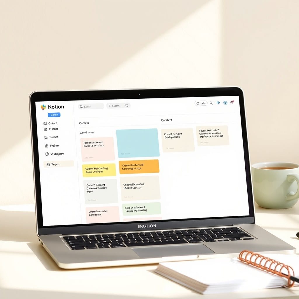
The weekly review is the most cited productivity ritual among makers I know. But it’s also the first thing to fall off the schedule when work gets busy. Why? Because most templates treat it like a project management audit, not a personal check-in. Here’s how to build a Notion template that’s gentle enough to stick and effective enough to keep you sane.
Start with the right structure. Don’t create a database with 15 properties—you’ll spend more time filling fields than reflecting. Instead, use a simple page with three sections: Wins, Challenges, and Next Week’s Focus. That’s it. The goal is to make the review take under 15 minutes. If it takes longer, you’ll skip it.
For the Wins section, list three to five things that went well, even if they’re small. This isn’t about toxic positivity; it’s about training your brain to notice progress. For Challenges, write down what felt hard or where you got stuck—this is data, not a complaint. Then, in Next Week’s Focus, pick one or two priorities that will move the needle. Don’t list five; you won’t do any of them.
Now, the tricky part: making it a habit. Link your review to an existing routine. For me, it’s Sunday evening after dinner. I have a recurring reminder in Notion, but I also put a sticky note on my laptop. The template should be accessible in one click—put it in your sidebar as a top-level page, not buried inside a database.
A few practical tweaks. Add a checkbox property for each week. That way, you can quickly see which weeks you completed. If you miss a week, don’t try to backfill it—just start fresh. Also, consider a “Backlog” section where you can dump random thoughts that come up during the review, so you don’t lose them.
What about metrics? Unless you’re tracking something specific like income or word count, skip the numbers. The review is qualitative. If you do want to track something, add a simple number property, but keep it to one or two metrics max.
One mistake I see often: making the template too pretty. Yes, aesthetics matter—we’re visual creatures—but don’t spend an hour choosing fonts and cover images. A clean, minimal layout with one accent color is enough. The template should feel like a calm, empty page, not a dashboard.
Finally, let the template evolve. After a month, adjust the sections based on what you actually need. Maybe you want to add a “Fun” section or a place for notes. The best template is one that you’re not afraid to change. Start with my basic structure and make it yours.
I’ve been using this system for six months, and it’s the first time I’ve kept up with a weekly review for more than a few weeks. It’s not because I’m disciplined—it’s because the template is simple and the ritual feels like a relief, not a chore. Try it for a month and see what changes.