When I started designing Notion templates, I made the same mistake most people do: I packed every inch with features. Databases everywhere, properties on every task, views for every possible angle. The result was a dashboard that looked impressive in screenshots but felt exhausting to use. It took me a while to realize that a calm dashboard isn’t about what you add — it’s about what you leave out.
The first principle I now follow is visual quiet. That means a muted color palette — warm whites, soft greens, and gentle earth tones. I avoid bright reds or electric blues because they create a sense of urgency even when there is none. I also limit the number of colors on a page to three or four. This might sound restrictive, but it forces you to use color intentionally: one accent for interactive elements, one for status highlights, and maybe a neutral for backgrounds.
Typography matters more than people think. In Notion, the default font is fine, but I always switch to the serif font for headings and the sans-serif for body text. The contrast between the two adds visual hierarchy without needing bold colors. I also use callout blocks sparingly — they’re great for tips, but if you have five callouts on a page, it starts to look like a ransom note.
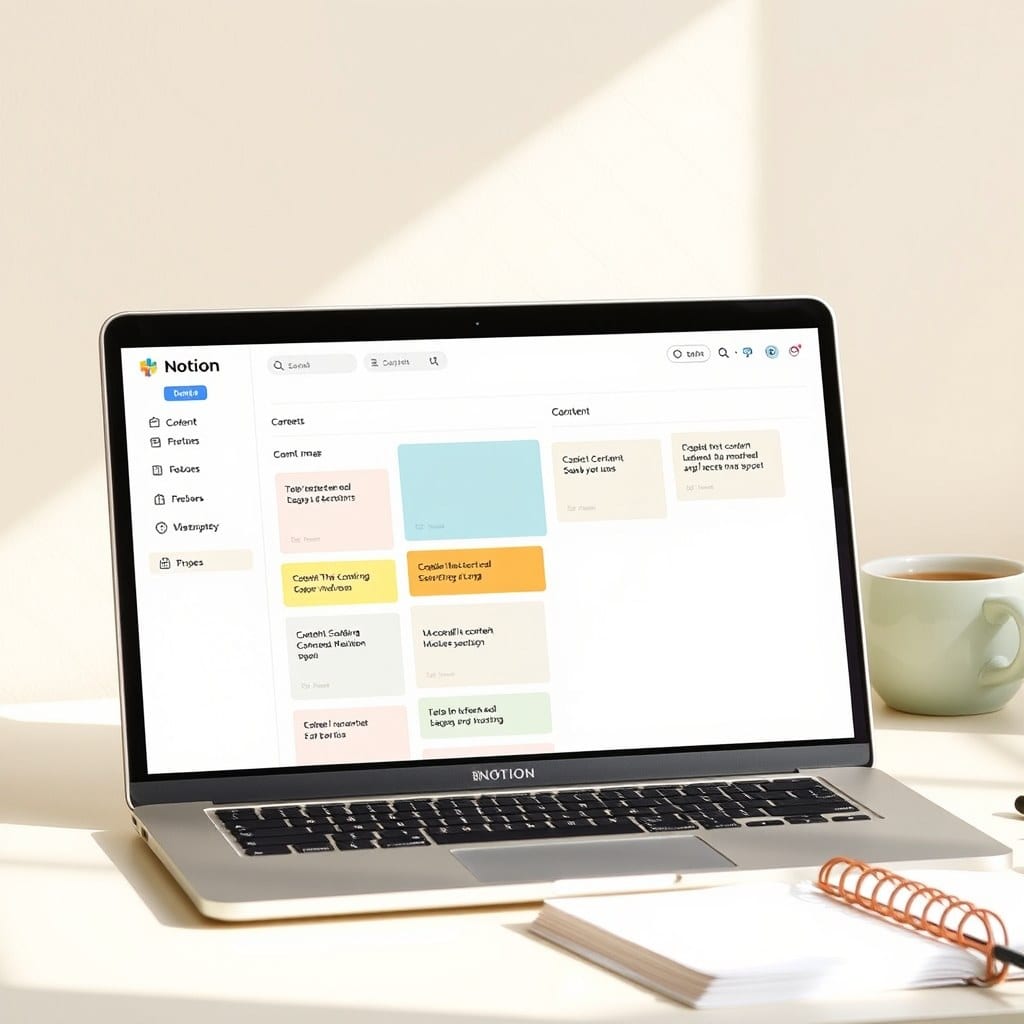
Layout is where the real calming magic happens. I design my dashboards on a strict grid. Every element — a heading, a database, a callout — gets positioned with intention. I leave generous margins and whitespace. A dashboard that’s crowded with blocks feels chaotic, even if the content is organized. I’ve found that a good rule of thumb is to have no more than three main sections on a page, and each section should focus on one task type: ‘Today’, ‘Upcoming’, and ‘Projects’.
Another key choice is the size of databases. I never show more than ten rows in a view by default. If you have twenty projects, you can group them by status or use a filter. The moment you scroll through a long list, you lose the overview. I also use the ‘card’ layout for many of my databases, because it makes each item feel like a distinct object rather than a line in a spreadsheet. Cards are easier to scan and feel more like a physical desk.
I also think about the emotional impact of the words on the dashboard. Instead of ‘Urgent’, I use ‘Needs attention’. Instead of ‘Deadline’, I use ‘Due’. It sounds like semantics, but language shapes perception. A dashboard that says ‘Overdue’ feels like a reproach; one that says ‘Past due’ is slightly gentler but still honest. I’ve tested both, and people who use ‘Past due’ report feeling less anxious about their tasks.
Finally, I add a small ‘breathing room’ element — a quote, a photo, or a simple line like ‘You’re doing fine’. It’s not a gimmick; it’s a reminder that the dashboard is a tool, not a judge. When I added that to my own workspace, I noticed I actually looked forward to opening Notion in the morning.
Designing a calming dashboard isn’t about being a minimalist for its own sake. It’s about creating a space where your brain can think clearly. When your tool doesn’t add noise, you can focus on the signal. And that’s what Meadow Goods is all about.